


Interview Design Challenge
By MemonID
About MemonID
MemonID.com is an independent entity which came into existence with the sole purpose of working as An agency helping community organizations taking better decisions in their charitable
& social activities by providing accurate information of community as a whole and if needed individual’s information.
My Design Challenge
While giivng interview with one of the core member of MemonID.com, Ali bhojani, he gave me a design challenge to redesign his landing page, to make it more usable and more minimalistic so that its more appealing to the users.
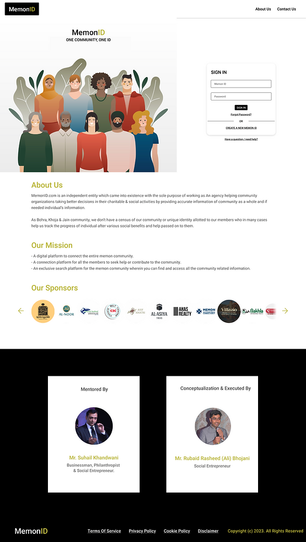
Here is the current Landing page of MemonID.com


Solving The Problem
To solve the given challenge which was to redesign the landing page, I decided to wear a user hat to empathize and experience the website's landing page myself to understand what and the why of the users purpose to visit the website.
Upon understanding and viewing the landing page from user's perspective, I switched back to my designing hat and started to design the landing page as per the given requirement and also designing a good user experience that will delight the user.
Upon carefully thinking about the problem I knew i needed to use a User centric approach and solve the problem by Design Thinking methodology. I rearranged some information architecture and doing some iterations, after getting some feedback from my family i ended up with the following designs. I did some iterations and made 3 variations of landing page.


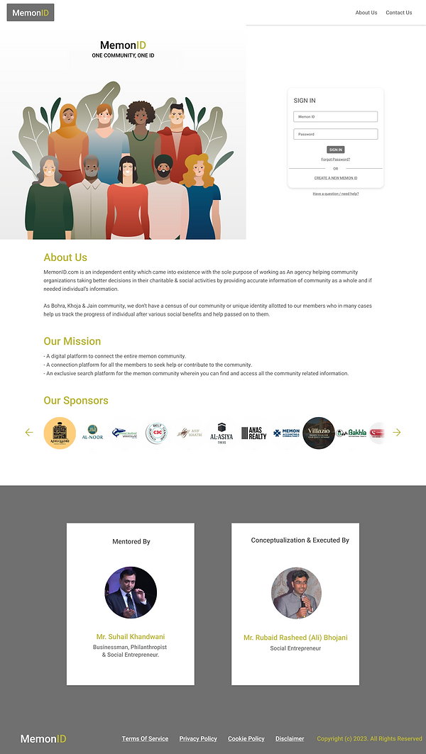
The above designs help the users understand the purpose of the site and guides them towards the next step which fulfills the purpose of a landing page. However User experience is all about inclusivity of users, meaning anyone and everyone shall be able to use the website or app or any digital product. Taking accessibility into account, I have made my designs to be accessible given the amount of time i had, i kept Accessibility of users in mind while choosing the size of text and colours and legibility of the website.
However we do know that Accessibility and inclusivity doesn't just come from visual perspective, it also means users with different devices shall be able to see and enjoy the same content and services of a website in other devices such as mobile, tablets etc.
In the Restrictive Time i tried to make the design responsive. Responsive Design for mobile enables more users to use the product and its services and overall increases the user experience for everyone. Here are my responsive designs for Mobiles.


As you can notice there are some differences in design in terms of button placements, that is because mobile is a touch device and there are regions which are easy to touch, so as to make sure we give them option which region touch works best for them, so that they click and use easily without getting frustrated. This increases the overall usability of the app and will ensure smoother experience after conducting a usability study.
The Takeaway
My study and observations to design a landing page as per requirement and also designing for to ensure delightful user experience helped me improve alot. Using Design thinking and having a user centric approach is alot more useful when there are feedbacks, within the given time constraint i relied on what was available to me, such using people around to gain some insights that a novice user might face, their feelings and emotions when its their first time, since landing pages are good way to engage with new users. I also understood the importance of a good landing page, as its the first thing a user will see when visiting your website.