


Brioche Case Study
Brioche & its Goals
About Brioche

The website is designed for users to view dishes of the restaurant and book a reservation hassle-free. Also to Leave reviews & feedback for restaurant to improve
Project Details
Project duration:
August 2023 to October 2023
The problem:
The restaurant had no way of collecting Insightful reviews from customers that can help it improve.
The goal:
A Review Page needs to be implemented and included in the website and that should be added to improve the overall user experience.
My role:
UX designer designing a website for brioche from conception to delivery.
Responsibilities:
Conducting interviews, paper and digital wireframing, low and high-fidelity prototyping, conducting usability studies, accounting for accessibility, and iterating on designs.
Understanding The User
User research: summary
I conducted several interviews and use empathy map to understand the users I am designing for and their needs. A primary user group identified through research were individuals who would often dine out and reviewers who critique the food and restaurants.
This group confirmed the initial assumptions about Bioche but the research conducted also revealed that not having a rating of food didnt help the customer to decide on what is worth their time and money.
User research: pain points
1. Process Pain Point
No way of leaving reviews or feedbacks about dishes or restaurant.
2. Lack Information to help user make decision
No rating of food on menu made customer confused and left them contemplating
3. Support Pain point
Difficult to reach out to the restaurants customer support.
4. lack of information about calories
Menu doesnt have an option to check calories.
Persona: Anas
Problem statement:
Anas is a Food critique who needs write review of the dishes and restaurants Because it helps his customers find a good place for time and money.

User Journey Map
User journey revealed How Brioche can be useful to the restaurants as well as the customer to improve their overall experience and quality.

Starting The Design
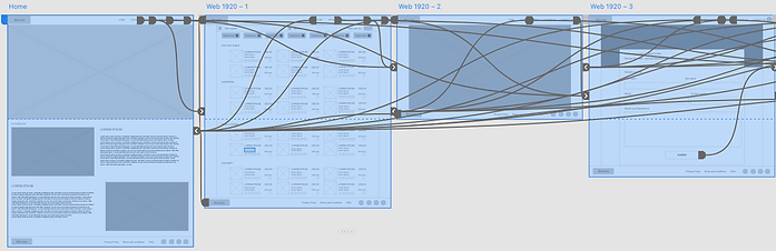
Sitemap
I considered all the possible data that is to be collected from the user or displayed to the user. Which gave me clarity about where and how to place the data and depending on their affinity or similarity they were grouped and separated respectively. This resulted in the sitemap on the right.

Paper Wireframes
Paper wireframes allows to get on with ideas and allows enough space for experimentation with efficiency. I initially draw multiple wireframes on paper to get to the one that really serves the purpose.

Digital Wireframes
I initially implemented a menu with dishes and ratings but after careful review with my peers they brought two features into my attention which was filter option and the option to hide calories.

I implemented an app version of the french restaurant brioche. In order to make it more accessible to more users. This will benefit the users as well as the Brioche, the french restaurant.

Low Fidelity Prototype
Check out the low fidelity prototype of brioche below:
Usability study: Parameters
Study type:
Unmoderated usability study
Location:
India, remote
Participants:
5 participants
Length:
20-30 minutes
Usability study: findings
3. Users found it much more Pleasant and informative after adding filter and calories information. I will need to keep iterating to improve the design and overall user experience.
Starting The Design
Mockups


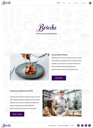


High Fidelity Prototype
After getting insights from usability study i was ready with this high fidelity prototype. Check this out :

Accessibility Consideration
1. The color combination were taken in consideration by providing good contrast and providing more accessibility.
2. The size of text and buttons are made with design guidelines to provide an easy accessibility experience for everyone.
Going Forward
Take Aways
Impact:
The brioche is designed with the purpose to help the business grow and also at the same time create meaningful and pleasant user experience that helps users make decisions as quick as possible. The goal was mainly to incorporate the review system into the website. So taking and using those reviews enable transparency between users and the business.
What I learned:
I learnt alot while designing UI UX for the brioche app. I had to conduct usability study on customer while trying to solve a problem for the business. Making the steps to review and giving various method to reach out to the organisation that will help the organisation grow. This enabled me to see problems from new perspective. The problem seemed to be with the organisation side which was partial truth, there was a big absence of process which had to be solved by using user centered approach.
Next Steps
1. Conduct more usability study in order to learn how much more the user experience can be improved and understand what changes are required to do so.
2. Add more accessibility features to provide much better experience to overall users. Also identifying areas where accessibility is lacking and is required.
3. Conduct more user research to identify new areas of need.
Let's Connect!
Thank you for your time reviewing my work on the Brioche! If you’d like to see more or get in touch, my contact information is provided below.
Email: aqdas.idris@gmail.com
Website: www.aqdasidris.co.in